

What we can learn
As a follower of the Jeffrey Zeldman school of thought,
I've been doing my best to do this anyway, but still, it doesn't hurt to be reminded of the importance of function as an integral part of the form. Here are five ways we can apply the design lessons from this programme:
Content precedes design. Design in the absence of content is not design, it's decoration.
— Jeffrey Zeldman (@zeldman) May 5, 2008
1. Use your colour palette as part of your message.
Colours can act as shorthand in and of themselves. One of my most recent designs, thehalloweenbusiness.com, uses a lot of orange because orange is the first colour that comes to mind when you think of Halloween. Needless to say, if I did a Christmas-themed website, red, white, and glowing yellows would feature very strongly in the design to make it reminiscent of firelight and Santa.
2. Choose your images carefully
In the Flesh uses carefully-framed images to get its message across. Here are a few of my favourites:
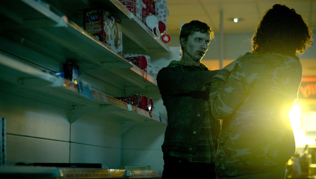
Notice the empty shelves of the supermarket where this attack scene takes place. See also the colours and the implication that it's taking place around Christmas. The low lighting and the glare from outside add to the implication that the world of the two people depicted here is overrun by zombies and that the forces of law and order are absent.
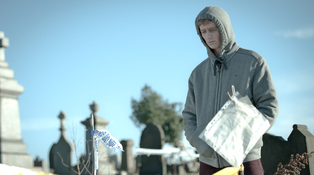
Kieran, dressed in a grey hoodie, visits his own grave. The bright sunny day contrasts visibly with his wan appearance. His trousers are the colour of dried blood and his face is very pale. His hands are in his pockets, indicating helplessness and an inability or unwillingness to act. The torn police line tape indicates the absence of law enforcement; throughout the story, there's no evidence that the cops have been called to sort out the messy incidents that ensue.
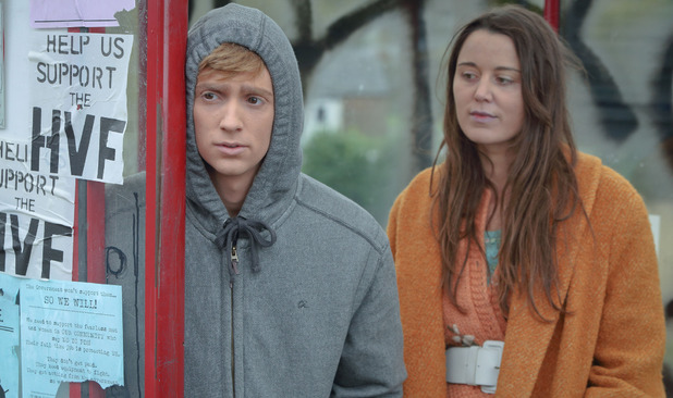
Here's Kieran with his old hunting partner Amy. Note the differences in the way they're dressed; Kieran is hiding and is dressed in cold, dull grey and maroon, colours that indicate his unwillingness to fully engage with life. Amy is dressed in bright, warm orange and blue; her head is uncovered and her hair is down, indicating that she's happy with her lot and has no wish to hide away, like Kieran does. She's also wearing a wide white belt, which barely covers a flower motif on her cardigan. This indicates innocence and purity. Nonetheless, on both of them, the cover-all mousse looks unnatural.
I got these images from Digital Spy. They're stills from the programme.
The point is, the pictures tell you what is going on and don't really require an explanation from myself. When you use images for your website, they need to demonstrate your point, not detract from it or distract the viewer. Nor should they be merely decoration. They should help to explain what the site is about. They should also be of the highest quality, not haloed, jagged, or patchy.
3. Don't overstate
If the pictures can tell the story of your website and get your message across, there's no need to explain them. If you need to explain them you're using the wrong pictures. Any words or text you add to the website need to be relevant and provide the information your visitors need to understand what the site is about and whether or not they should either contact you or get their wallets out and prepare to spend money.
4. Don't understate
In a post I wrote a while ago, I discussed what a website ought to be and how designers often fall into the trap of making them pretty instead of providing viewers with the information they need to help them decide whether or not they want to do business with them. Proper SEO (as opposed to the sneaky, cheating kind that soars up the search engine rankings but does nothing for people seeking information) requires useful content. As I've said I don't know how many times, nobody ever visited a website because it was pretty, but because it was useful or entertaining. The goal of your design ought to be to create a website that people go to in order to find what they're looking for under those search terms. Floating to the top of the search results is no flippin' good if you're not providing useful or desirable content. You'll float to the top of the search engine results, but that won't convert into business unless you provide a reason for the punter to either contact you, sign up for something, or get his wallet out.
5. Captivate
The images and text, etc., on your website need to grip the imagination of your viewers by provoking an emotional response. The quirky kitty on thehalloweenbusiness.com will almost certainly raise a smile, as will Shannon Shue's outlandish outfit for her television interview in the video on the home page. The rotating images of John Staddon's books on the home page of themalignhand.com show that he's a prolific writer and blogger. gadget-force.com leaves the impression of a futuristic world of technology with flavours of fantasy and science fiction. The devices you use, be they text, font, colour, or image, need to tell the story in a glance, and each element needs to reinforce the other. Use commanding words like "Buy Now!" or "Sign Up" on your call-to-action buttons to elicit a response. Compelling content provokes a response. If your content isn't compelling, you won't get a response, it's as simple as that. Needless to say, teaser text to lead people to other parts of your website is a good thing to do because it increases the likelihood that the visitor will share a link to your website — which you really want to happen to increase its popularity and therefore the opportunity to get business.
Conclusion
It's important to remember that the point of design is to showcase the content, not simply to produce a pretty image or product. This is a lesson that can be applied across a range of disciplines, from film to graphic and website design.
[...] Here is the original post: How TV's In The Flesh Demonstrates The Point Of Design | Wendy … [...]
ReplyDelete[...] Here is the original post: How TV's In The Flesh Demonstrates The Point Of Design | Wendy … [...]
ReplyDelete